The Fully Functional Bundle Creator

Recap
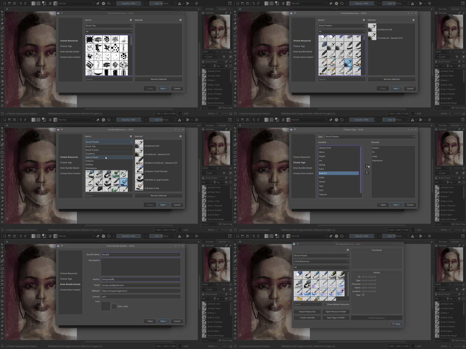
Welcome back! Last time, I successfully completed the development of the Bundle Creator up to the Resource Chooser page. This page now allows us to easily select resource items by applying filters based on tags or names. I’ve introduced some UI improvements, including the ability to click-to-select, the addition of a convenient Remove Selected button and the introduction of a visually appealing grid view to replace the traditional list view. These enhancements enhance the overall user experience and provide a more streamlined resource selection process.
The Bundle Creator Wizard
As mentioned in previous blog posts, the Bundle Creator consists of four pages: the Resource Chooser, Tag Chooser, Bundle Details, and Save to pages. These pages can be seen in the wizard’s side widget, and users can navigate between them using the Next and Back buttons. The Tag Chooser page retains a similar design to the Embed Tags page from the previous version of the bundle creator. It offers a familiar interface for users to select and embed tags to their new bundle. Similarly, the Bundle Details page maintains consistency with the previous bundle creator, where one can fill out the bundle name, author, website etc.
The inclusion of the Save to Page adds a crucial final step to the bundle creation process. It provides a summary of the bundle details, which includes the number of selected resource items per resource type, and the tags chosen for embedding. This comprehensive summary allows users to review and confirm their bundle’s content before finalizing the creation process.
By dividing the bundle creation process into these distinct and user-friendly pages, particularly for beginners, the Bundle Creator offers a streamlined and intuitive experience. Users can efficiently navigate through each step, making informed decisions and customizing their bundles according to their specific needs.

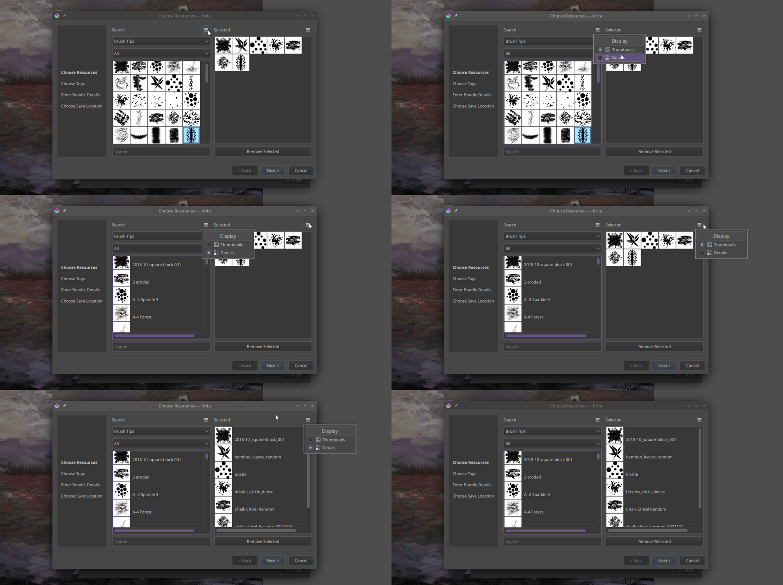
I have added a small tool button that allows switching between grid view and list view in both the resource manager and bundle creator, providing convenience to the users. Additionally, I have made the icons in the bundle creator more consistent.

Merge Request
My merge request can be viewed here.
Plans ahead
In the upcoming weeks, I would be working on adding the editing bundles feature, as well as improving the Choose Tags section. This requires some UI related feedback, and if you’re interested to help out, please feel free to drop a comment on this post I created on Krita Artists Forum!